Definition of a Landing Page
First things first (a pet peeve is folks who get this part wrong…).
A landing page is any page on a website where traffic is sent specifically to prompt a certain action or result. Think of a golf course… a landing page is the putting green that you drive the ball (prospect) to.
– Copyblogger
Although a landing page (also known as a squeeze page) could be any web page that a visitor can land on, we believe in a stricter meaning. We consider a landing page to be a standalone web page separate from your main website. It forces a visitor to focus on a single objective, such as subscribe, buy or join.
The most effective landing pages are targeted to a particular stream of traffic, such as a targeted offer through social media, a newsletter or a pay-per-click (PPC) campaign. If a landing page provides an interesting offer with a lead capture form, you can convert at a higher rate.
Most importantly, we try to limit any navigation. With any traffic we drive to the page, we strive to get the visitor to take our single desired action. No menus, social media links or other elements that lead visitors away allowed.
Types of Landing Pages
We build a couple of basic categories of landing pages:
- Click Through: Lead the visitor to click through to another page, such as product details (the landing page could be an offer).
- Lead Generation: Capture visitor information with a form, such as name and email address. Lead gen landing pages initiate the sales funnel.
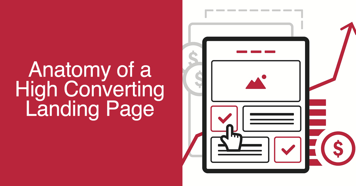
Key Elements of a High Converting Landing Page
Logo
Even if your landing page fails to convert, you will at least have made a brand impression.
Images
We love using a strong hero shot that reflects the context of your offering. It can be a still image or a video (bonus points for conversion). You want something that offers those ‘thousand words’: happy customers, product shots, product demonstration, customer testimonial, user story…
Headline
As Claude Hopkins taught us many years ago, a headline is one of the most important tools to lead customers to the desired outcome. We emphasize benefits in our headline as often as possible.
Subheadline
If the hook came from the headline, the subheadline continues any momentum. “Stick the landing” and you improve your conversion ratio.
Clear Copy
Ah, writing… Like the poetry in Dead Poet’s Society, if you nail the copy, you’ll move your audience. Keep it simple (no jargon, no matter what), brief, and in the language of your customers, not necessarily your industry. Copy that converts requires discipline and attention to detail. Test with your friends. Split test with your audience. Learn and adapt.
Unique Selling Proposition
This is less a single element than a theme – you must provide something that moves the visitor to the action. A unique selling proposition, a message that separates you from ‘the other guys’, is required. Better, faster, cheaper, cooler… Focus on your benefits, not your features, and ake them easily scannable – although you’re writing more than the minimum, only a portion of your audience reads between the (head)lines.
Get more.
Pay less.
More fun.
Use it anywhere.
For the deep thinkers, provide access to the details too (by the way, they’ll work for it more than scanners). Include but don’t emphasize.
Offer
Must. Provide. Value. If you expect anyone to give you their information or buy something, they need an interesting offer. Tell me what you’re giving me and help me understand why I want it NOW, and I just might take you up on it…
Strong Call to Action
In most cases, your call to action will be a form (unless you’re using a click through page). Most research indicates that fewer fields, especially for new business, works to your advantage. Capture the minimum data you can get away with (ask too many questions, and the user leaves).
We’ll reiterate again, that we recommend zero external or internal inks on landing pages. You want the call to action to be the emphasis. The exception would be to provide more information to drive home that call to action, hopefully without introducing the rest of your site to the visitor.
Trust Indicators
Visually, there are a number of subtle tactics you can do to build trust with new prospects. If your page looks well-designed, that’s a start; pages that haven’t been updated since 2005 scare visitors away. Including logos from reputable clients or secure trust marks definitely helps. And if you can showcase client testimonials, especially visually, your conversions should improve.
Template Elements
In your landing pages, you may include a few other items at the bottom of your page:
- Logo (a branding reminder)
- Copyright Notice
- Phone Number (alternative way to contact you)
- Address (another trust signal)
Hidden Elements
Two other strategic elements should be considered for inclusion in strong converting landing pages:
- Analytics: tracking activity is essential
- SEO: we love when our landing pages double as traffic magnets on their own
Landing pages are an important foundation for online marketing because they help increase your conversion rates. By targeting promotions or products with specific landing pages, visitors are focused on the single objective that brought them to your page. In addition, high converting landing pages include a number of elements to build trust with the audience, from a unique selling proposition to empathetic copywriting to social proof. Each smart element builds a stronger connection for the visitor to the offer, and ultimately, that drives more conversions and sales.



![Video Engagement [Infographic]](https://twistedpuppy.com/wp-content/uploads/2017/08/twisted-puppy-blog-video-engagement-1-500x383.png)

[…] websites, do more marketing, write more blogs. One of the smartest tools in that paradigm shift was Productivity Planner, a new daily organizer from the folks who brought us Five Minute Journal (we’re on year two […]