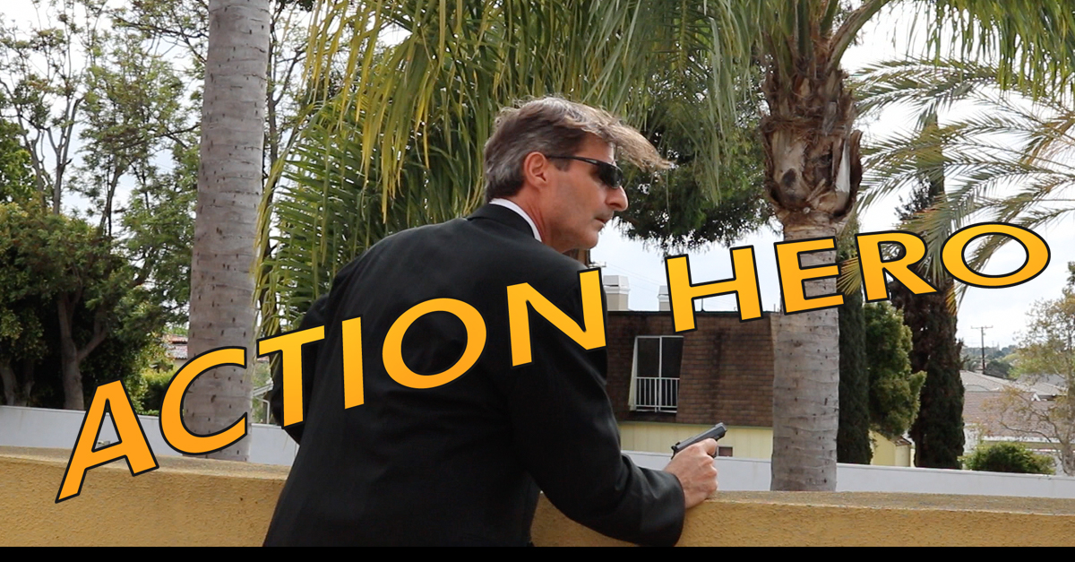
[vc_row][vc_column][rs_space height=”16px”][vc_btn title=”Watch Video Version on YouTube” style=”flat” color=”success” size=”lg” align=”center” i_icon_fontawesome=”fa fa-youtube-play” link=”url:https%3A%2F%2Fyoutu.be%2F5v8Sp4PPU7E|title:Watch%20Video%20Version%20on%20YouTube|target:%20_blank|” add_icon=”true”][rs_space height=”16px”][vc_column_text align=”left”]Stallone? Willis? Diesel? Cruise? Schwarzenneger! Yes, we’ve all been taken away to another place by a glorious action hero. Why? Because they convinced us of something. Yeah, we’re talking about magic like:
- Yippee-ki-yay…
- Live for nothing or die for something.
- Do you feel lucky, punk?
- And a personal favorite: I have come here to chew bubble gum and kick ass…and I’m all out of bubble gum.
That’s what we’re talking about today: creating the magic that drives ACTION.[/vc_column_text][vc_column_text]On your website, you know you have to follow AIDA: Attention | Interest | Desire | Action. We’ve talked extensively about the first 3 in previous Twisted Puppy blog posts. Those are all the setup items. Now…it’s time for the close.
On your website, if you don’t close, you don’t get revenue. So ACTION is one of the most important aspects of the AIDA marketing pillars.
Remember:
Always.
Be.
Converting.
Now Let’s dig in on what ACTION really means.
Someone landed on your website, they’ve read your compelling copywriting, perused your social proof…and then… You need a Call to Action (also known as a CTA).
Calls to Action are verbs…
- Subscribe
- Buy
- Download
- Order
- Request
- Get
- Discover
A call to action is typically driving a link, button or form on your website.
A link or a button that links to another page is called a click-thru. You can track funnels with how many people clicked through to another page, like a product tour or a registration page. It adds a bit more friction to the user experience, but it also allows you to minimize the clutter on a landing page. It’s worth experimenting with click-thru CTAs on occasion.
On the other hand, a form can capture key visitor information on the SAME page. It may be one field, like an email address, or a complete registration. The more fields, the more friction, so most conversion experts recommend keeping forms as short as possible. You can ALWAYS ask visitors to add more information later (like “be active in our community and complete your profile“). Completing your form is a conversion.
What makes a good call to action? Here are ten secrets of an Action Hero to help you.
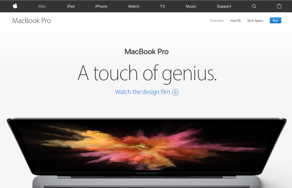
1. Add a reason to your call to action.
A button cannot stand alone.
- Subscribe
for Special Discounts - Join Today
to Get Free Access for 30 Days! - Get 20% off of first purchase
Enter your email now!
Sounds more enticing than SUBSCRIBE, doesn’t it?
2. Shape your target audience.
If your audience knows that they “fit”, they’re more likely to take action.
We accommodate budgets of many sizes.
View Pricing Plans
Get Your FREE 60-Minute Strategy Session
If your business generates over $250,000 a year, we can help identify your biggest opportunities.
Request a Consultation
Let the audience know where they stand.
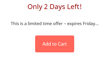
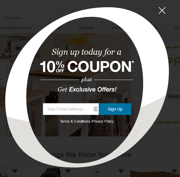
3. Add urgency to your call to action.
You’ve probably read about FOMO (Fear of Missing Out), and no doubt it’s been used on YOU.
- Only 2 days left
- While supplies last
- Now
It’s a psychological edge you can always try. And…it works better than we’d like…
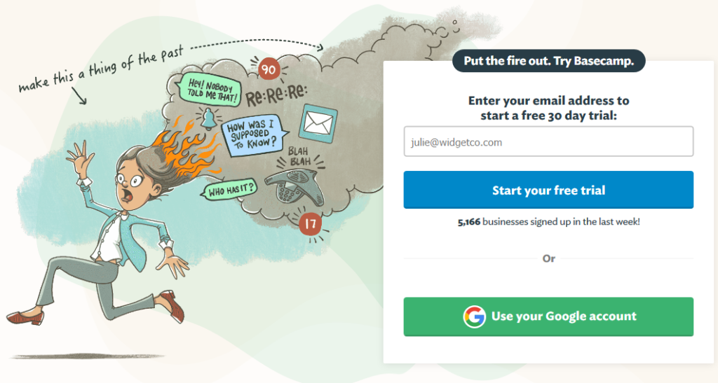
4. Use additional social proof.
As the saying goes, no one wants to eat in an empty restaurant. Show you’re a popular or quality choice.
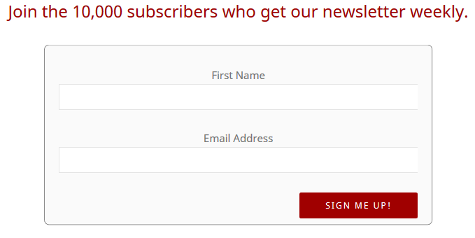
Join the 10,000 subscribers who get our newsletter weekly. Enter your email below.
Hey, don’t miss out – we deliver a 5 star experience…
Get visitors to join your tribe!
5. Try to focus pages on a single call to action.
It’s best to minimize on CTAs. Build up your copywriting to drive one, maybe two actions. You can add a secondary action if the main CTA is too big. For example, if the main goal is to get an email address through a CTA like Request a Consultation, a secondary goal could be to Watch a Video.
Or if your CTA is Download Our White Paper, a secondary goal could be to read the preview of the white paper (via a click-thru) and that page also has the Download form.
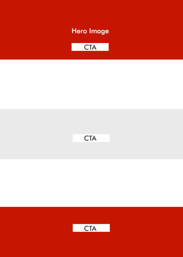
We worked on a project that repeated the same CTA all the way down the page – your eyes start filtering them out. So don’t offer the same thing repeatedly. Try placing your CTA above the fold and perhaps in the middle or at the bottom of the page, but don’t repeat more than a couple of times.
Speaking of placement,
6. Consider the location of your call to action.
Above the fold? Could be too early in the page, depending on the action. We challenged a client over “Chat with an Expert” in the hero section. No one was clicking it because the visitor hasn’t read any messaging yet. Middle of the page? Sounds good, but again, might be too early. Bottom of the page? Maybe the visitor never scrolls that far.
Experiment to see what works with your content. Use placement and repetition as experiment variables. Bear in mind that the CTA has to match the temperature of your audience (from ice cold to lava hot).
7. Use personal, compelling language around your CTAs.
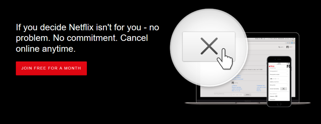
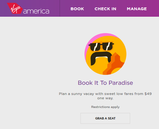
Words that typically show higher conversion rates:
- You or Your
- Guarantee
- Results
- FREE
- New
Personally, I love ‘Secrets or Tips’ in offers – everyone wants to know a secret…
Words you should avoid on your CTAs include:
- SUBMIT
- ORDER
8. Provide alternatives on your CTAs for those who may want a different approach.
Some visitors don’t want any more email. They’re fatigued by online marketing. Give them another option.
- Visit us at the {Industry Conference} in May.
- For even faster service, call 555-1212.
You can even track mobile phone calls as conversions if you use a good analytics tool.


9. Take advantage of the principle of reciprocity…
From the early days of the web, we’ve practiced give-to-get. It’s based on a psychological principle called reciprocity. It means that if I give you something for free, you feel an obligation to pay me back. If you give your visitor something useful, they’ll pay you back more than your original gift.
Design giveaways into your marketing plan. We love “splitting the ask” into small bites. If your first transaction is “request a consultation”, you’re immediately creating friction. You could be a big pest, calling me every week. You know those sales guys, right? Give ’em an inch and they call you a thousand times. But…
With reciprocity, you earn trust and that obligation. It’s different to get a follow-up email saying “Hey, what did you think of the case study? Would you be interested in seeing how our product could work for you in a 20 minute demonstration?” You’ve just split the ask as you created value and established a connection of trust.
10. Experiment (split-test) your call to action.
If any marketing firm, including Twisted Puppy, tries to convince you they are experts, run away. What worked for one client may not work for another. What really works is testing. You should try different offers, calls to action, copywriting and designs to see what works for YOU. You’re unique and your audience is unique.
Don’t just copy what your competitor does either – they could be spending a ton of advertising and marketing money on stuff that doesn’t work either.
For smaller businesses, you’re limited by a small sample size. A simple rule of thumb is that your test needs to run at least a thousand times, so if you only have 100 visitors a month, it’s harder. You need to find ways to get more traffic (ATTENTION), but you can still run a test or two with whatever traffic you have.
Are you ready to be a Call to Action Hero?
Let’s recap…
1. Add a reason to your call to action.
2. Shape your target audience.
3. Add urgency to your call to action.
4. Use additional social proof.
5. Try to focus pages on a single Call to Action.
6. Consider the location of your Call to Action.
7. Use personal, compelling language around your CTAs.
8. Provide alternatives on your CTAs for those who may want a different approach.
9. Take advantage of the principle of reciprocity…
10. Experiment.
Thanks for checking out the Twisted Puppy blog. If you haven’t subscribed already, please do. If you’re new to our blog, be sure to check out the archives. We value your time, so we only post good stuff!
Hasta-la-vista baby…[/vc_column_text][/vc_column][/vc_row][vc_row][vc_column][vc_row_inner fluid=”yes” margin=”mt-70 mb-70 mt-xs-50 mb-xs-50″ bgcolor=”#eaeaea”][vc_column_inner][vc_column_text align=”center”]
Need Help Building Traffic and Conversions on YOUR Website?
Get a free 30-minute consultation to review your website’s unique challenges.[/vc_column_text][vc_btn title=”Get a Free Website Analysis” style=”flat” color=”info” size=”lg” align=”center” i_icon_fontawesome=”fa fa-comments” link=”url:http%3A%2F%2Ftwistedpuppy.com%2Frequest-quick-consultation%2F|title:Get%20a%20Free%20Website%20Analysis||” add_icon=”true”][/vc_column_inner][/vc_row_inner][rs_space height=”80px”][/vc_column][/vc_row]





![Video Engagement [Infographic]](https://twistedpuppy.com/wp-content/uploads/2017/08/twisted-puppy-blog-video-engagement-1-500x383.png)

Leave A Comment